The Art of Designing an Effective Contact Us Page for Mindful Practices
In today’s digital-first world, the Contact Us page is more than just a form or a list of contact details — it’s an opportunity to create connection, convey values, and deepen engagement with anyone who visits your site. This is especially true for mindful practices like yoga and wellness, where trust, clarity, and calm communication are part of your brand experience. A thoughtfully crafted Contact Us page can become a silent ambassador for your practice, inviting visitors to take the next step with confidence and ease.
Whether you’re redesigning your current page or building one from scratch, this guide will walk you through the key elements of an effective Contact Us page that resonates with your audience and supports your mission.
By the end, you’ll understand not only best practices in design and messaging but also how to refine your page for clarity and accessibility — essential ingredients for mindful practices online.
Why Your Contact Us Page Matters in Mindful Practices
First Point of Connection
The Contact Us page often serves as the first direct point of connection between your visitors and your team. For many people exploring yoga studios, wellness centers, or holistic health services, this page signals how responsive and open your practice is to support. Visitors aren’t just looking for a phone number — they’re evaluating whether they feel welcomed and supported.
Consider how a prospective yoga student decides to reach out: they look for clarity, comfort, and confidence that their questions will be heard. A calm, well-organized Contact Us page fosters that first trust.
Building Trust and Credibility
In a mindful context, trust is everything. Clear communication reflects the core values of your practice — presence, attention, and care. When your Contact Us page is easy to navigate, transparent about response times, and genuine in tone, visitors feel reassured that they’re engaging with a credible service.
For broader perspectives on building user trust through web content, check out this useful article on improving online engagement through thoughtful UX strategies at Smart Article.
Key Elements of an Effective Mindful Contact Us Page
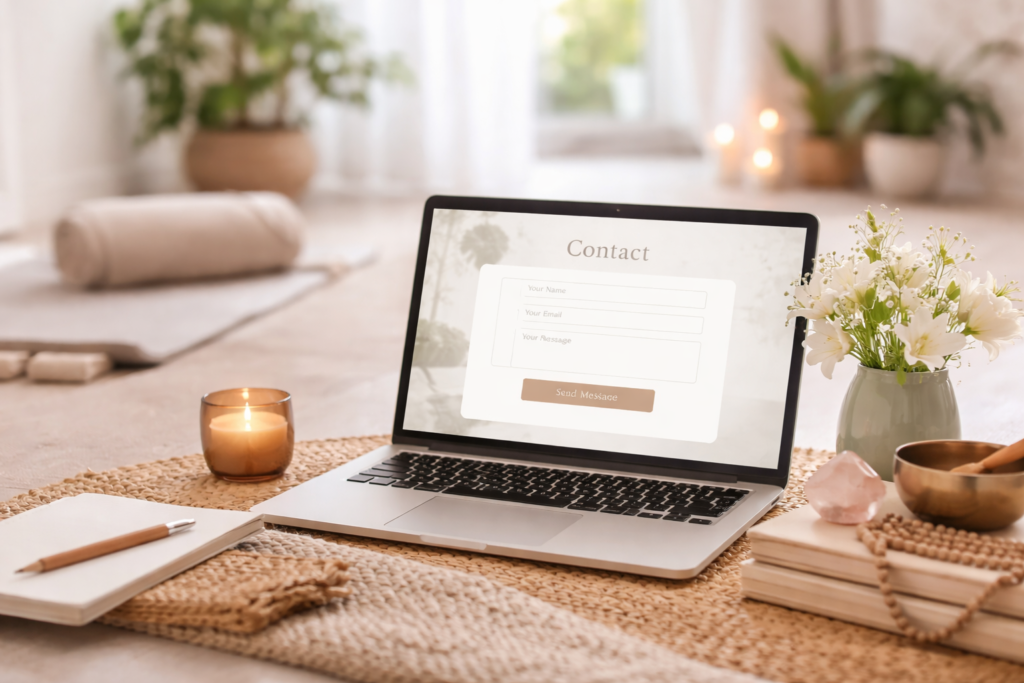
Clear and Simple Layout
Clutter-free design promotes focus. Just as a yoga studio clears space for practice, your Contact Us page should clear visual noise to highlight essential information. A straightforward layout helps users quickly find the details they need — phone number, email, location, hours, or social handles.
Break information into discernible sections, use readable fonts, and keep whitespace to create a calming visual rhythm.
Accessibility and Ease of Use
A good Contact Us page is accessible to everyone. Ensure:
- The page is mobile-responsive
- Form fields are labeled clearly
- Keyboard navigation is seamless
- Alternative contact methods (like email or direct phone) are visible
Accessibility isn’t just inclusive; it also improves the overall experience for all users. To learn more about creating inclusive design, you might enjoy this article on universal web design principles at Smart Article.
Personalization and Warmth
Mindful practices are personal experiences. Reflect that in your wording. Instead of generic “submit” buttons, consider language that feels gentle and human, such as “Send us your thoughts” or “We’d love to hear from you.” A short, welcoming message at the start of the page can set a tone of warmth and approachability.
For instance, a yoga studio might say, “Have questions about classes or schedule? We’re here to help.” This voice aligns more naturally with mindful branding than sterile corporate phrasing.
Incorporating Visuals and Mindful Design
Use of Calming Colors and Typography
Color psychology matters. Soft hues like muted blues, gentle greens, or warm neutrals evoke calm and create a sense of space. Pair these with legible sans-serif or lightly serifed fonts for clarity and ease.
Avoid heavy contrasts or overly bright colors, which can overwhelm the visitor and disrupt the serene experience you’re trying to convey.
Integration of Location Maps and Media
Including a location map (if you have a physical studio), photos of your space, or images that represent your practice can make your Contact Us page feel more grounded and real. Visitors appreciate seeing familiar visuals before reaching out — it’s a subtle way of building comfort and connection.
However, be mindful of page load times: prioritize optimized images and lightweight embeds.
Encouraging Action Without Being Pushy
Clear Call-to-Action (CTA)
Your Contact Us page should gently guide visitors toward reaching out without aggressive or salesy messaging. A clear but calm call-to-action is key. Examples include:
- “Let’s start a conversation.”
- “Reach out to learn more about our classes.”
- “Questions? We’re happy to help.”
Avoid flashing banners or urgent language like “Act now!” which contradicts the reflective nature of mindful practices.
Trust Signals and Social Proof
Adding subtle trust signals — like short testimonials from students or badges/certifications — lets visitors feel confident that they’re connecting with a reputable practice. These should be placed thoughtfully to reinforce trust without diverting attention from the main contact action.
Real-World Example: Yoga Studio Contact Us Page Done Right
To see how these elements come together in a real-world example, take a look at how practitioners can easily contact Ashtanga Yoga Shala via their thoughtfully designed page: contact Ashtanga Yoga Shala. Their layout demonstrates a balance of essential information, gentle tone, and accessibility — a great case study for mindful practices looking to inspire their own Contact Us pages.
Studying effective examples like this helps contextualize design principles and messaging choices in action.
Tips for Continuous Improvement
Your Contact Us page doesn’t have to be static. Use data and user feedback to refine and enhance it over time.
- A/B Testing: Compare different form layouts, button text, or visual arrangements to see which yields better engagement.
- Visitor Feedback: Invite users to comment on ease of use directly or indirectly after submitting a form.
- Analytics Monitoring: Understand how visitors reach the page, where they may drop off, and what information they interact with most.
Iterative improvements ensure that your Contact Us page evolves with your audience’s needs.
Conclusion
A well-designed Contact Us page is a silent ambassador of your brand — it communicates your values, builds trust, and gently invites visitors to connect. For mindful and wellness practices, this page should reflect clarity, accessibility, warmth, and calm. By focusing on simplicity, personalization, accessibility, and continuous refinement, you create a space where visitors feel seen and supported.
With careful design and thoughtful messaging, your Contact Us page becomes more than a functional endpoint — it becomes a welcoming doorway into your community.
Sub-title: Thoughtful communication starts with a mindful Contact Us page that reflects your values and invites genuine connection.